Teo Jia Ling
Aspiring Data Cleaner, Analyst and Statistician

I don't just clean, analyze and build dashboards with raw data.
I uncover the untold stories hidden within a mess of numbers and information,
revealing interesting truths that one wouldn't even know they were looking for.
To me, there's something thrilling about unravelling hidden insights from complicated data.
I'm passionate about transforming dirty data into thought-provoking stories,
sharing insights that inform strategy, spark curiosity and a call to action.
People hear statistics, but I tell stories with statistics
Aspiring Statistician Ready to Make an Impact
I am an aspiring statistician and data analyst.
With a degree background in Economics (NUS) and tutoring,
I’ve always been passionate about learning.
Now, I channel that passion into helping others learn insights from complex data.
Revealing unexpected stories from data never fails to leave me in awe and wonder!
Oh, the joy of discovery!
-
Python
100% -
Tableau
100% -
Excel
100% -
SQL
60% -
R
60% -
HTML, CSS, JavaScript
15%
Technical Skills
| Data Cleaning | Exploratory Data Analysis |
| Data Visualizations | Time Series Forecasting |
| Data Validation (Regex) | Machine Learning (Sci-Kit Learn) |
Data Analysis and Visualization
Portfolio
The full code to Python Visualizations can be found on my GitHub.
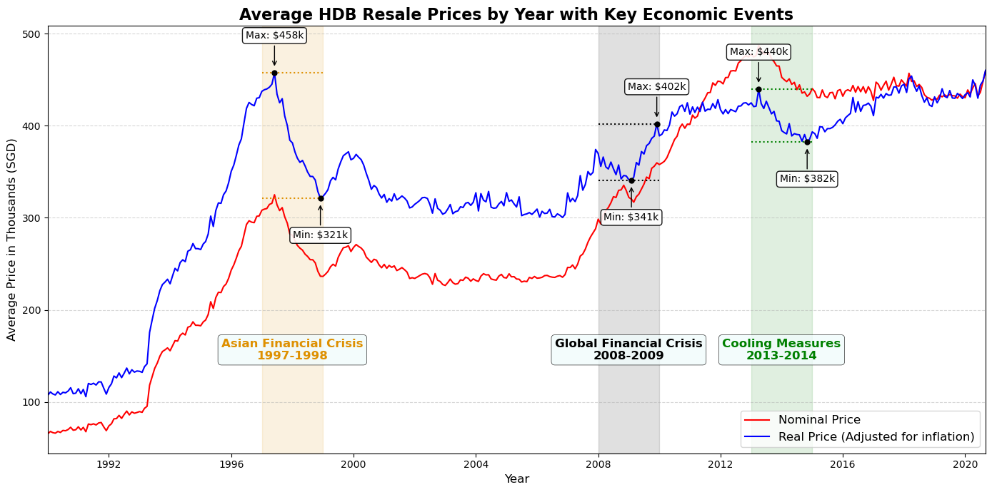
Trend of HDB Prices - Time Series Analysis
This visualisation was conducted in Python. Using pandas, I first merged multiple HDB prices data sets (nominal) from data.gov.sg.
Then, I adjusted the prices for inflation, by joining a seperate CPI dataset from data.gov.sg.
This transformed the nominal prices in my existing merged data set, to reflect the real prices.
Then, I researched economic crisises from 1990 to 2020 that could explain the steep fall and rise in HDB prices.
Finally, this graph was plotted and annotated with matplotlib and seaborn in Python.
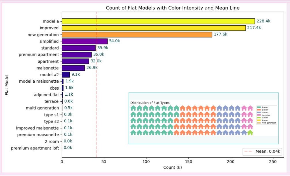
Sales Distribution of HDB Flat Models using Python
The smaller visualisation was done in Python, with a different library called PyWaffle, which is
great for displaying parts of a whole using a grid of squares. It's built on top of matplotlib.
The outer visualisation was plotted and annotated with matplotlib and it's colormap module.
I then stacked both visualizations on top of each other in Tableau with Story.
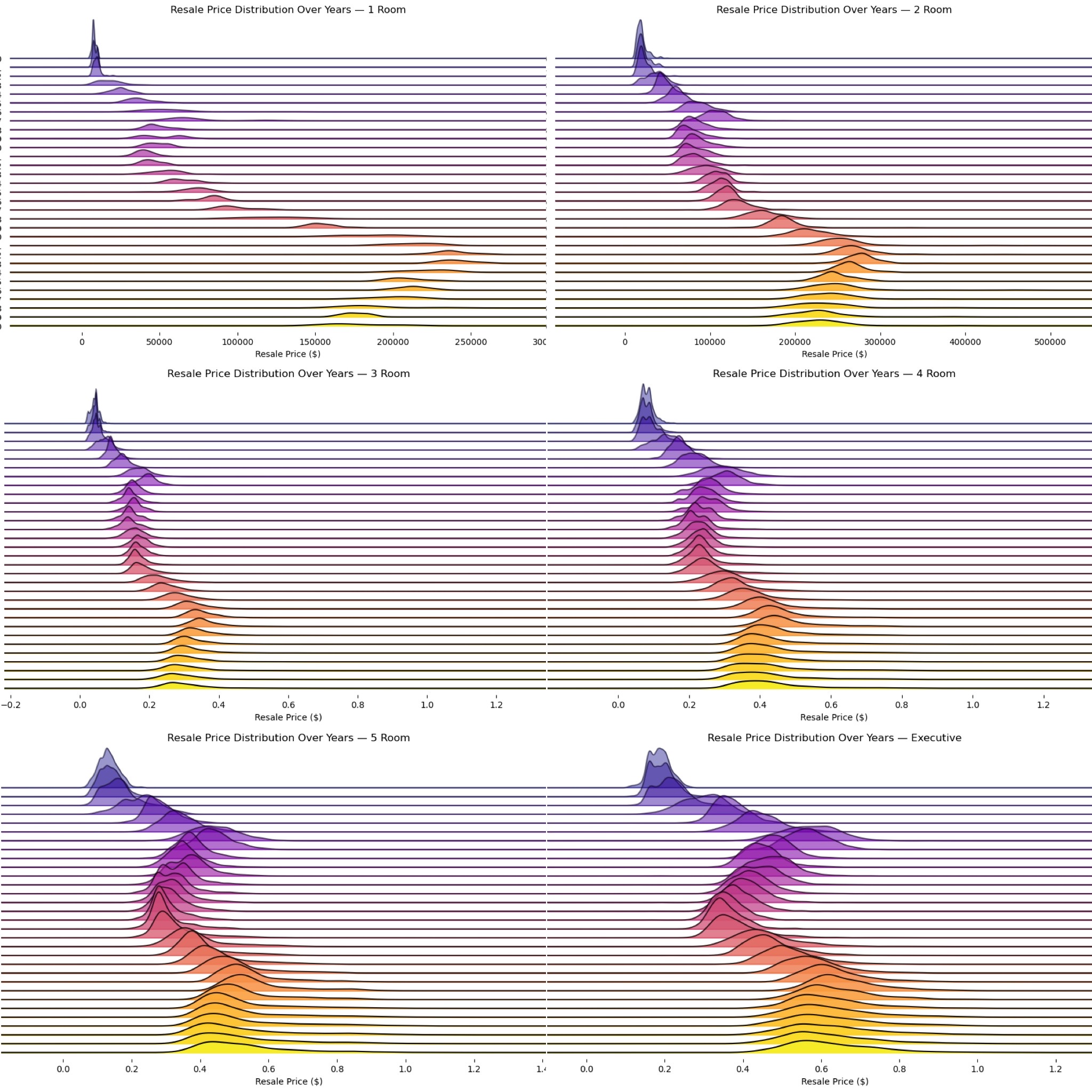
Ridge Plot of HDB Prices by Model Type - Time Series Analysis
This visualisation is a ridge plot, which shows the distribution of a numeric variable for multiple
categories using overlapping density plots. It’s useful for comparing distributions across categories. I used the joyplot library,
together with matplotlib and seaborn in Python to plot this.
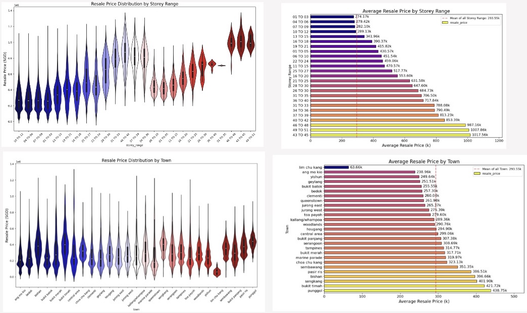
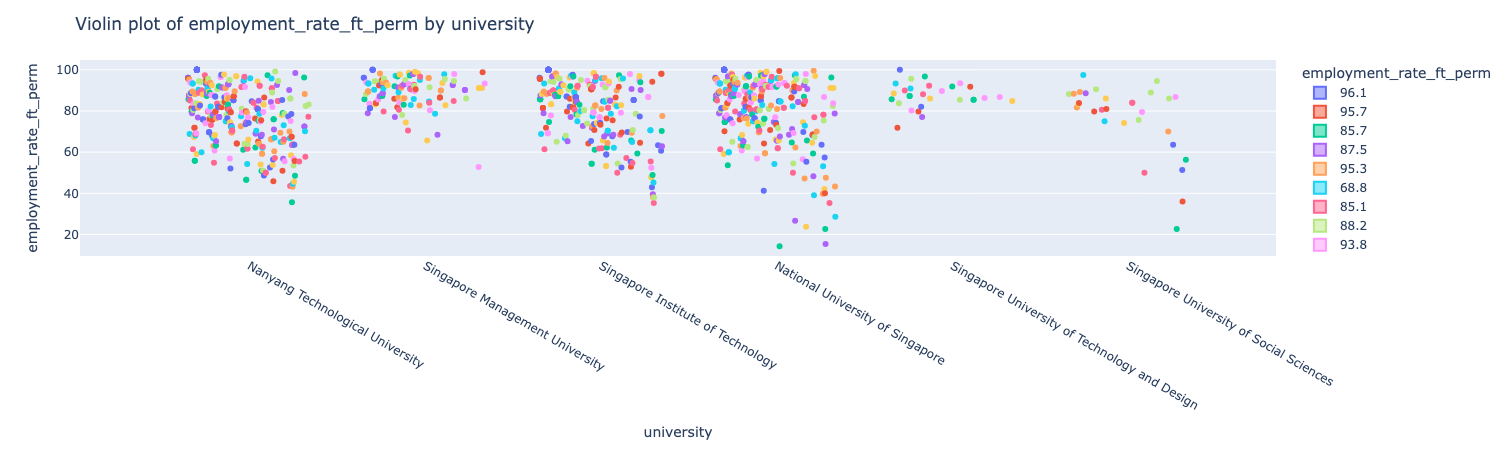
Violin Plot of HDB Prices by Town and Storey Range
This visualisation is a violin plot, which is a combination of a box plot and a kernel density plot.
It shows the distribution of a numeric variable, its probability density, central tendency, and spread.
It is useful in comparing distributions across multiple categories.
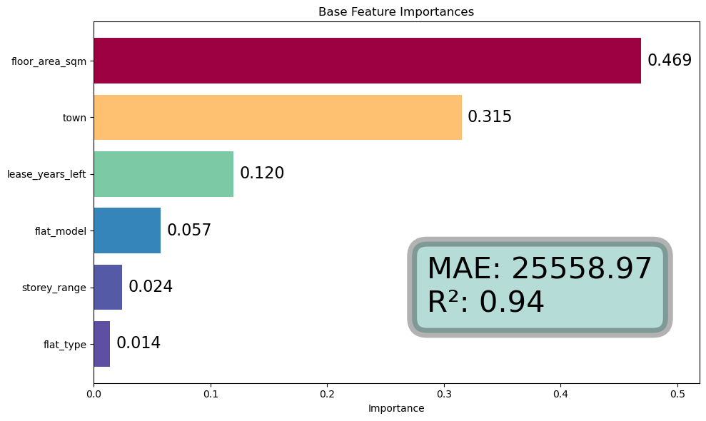
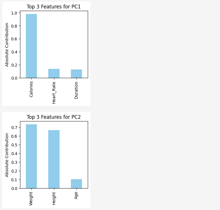
Visualizing Feature Importance of a Random Tree Regressor Model -
This visualisation is a ridge plot, which shows the distribution of a numeric variable for multiple
categories using overlapping density plots. It’s useful for comparing distributions across categories. I used the joyplot library,
together with matplotlib and seaborn in Python to plot this.
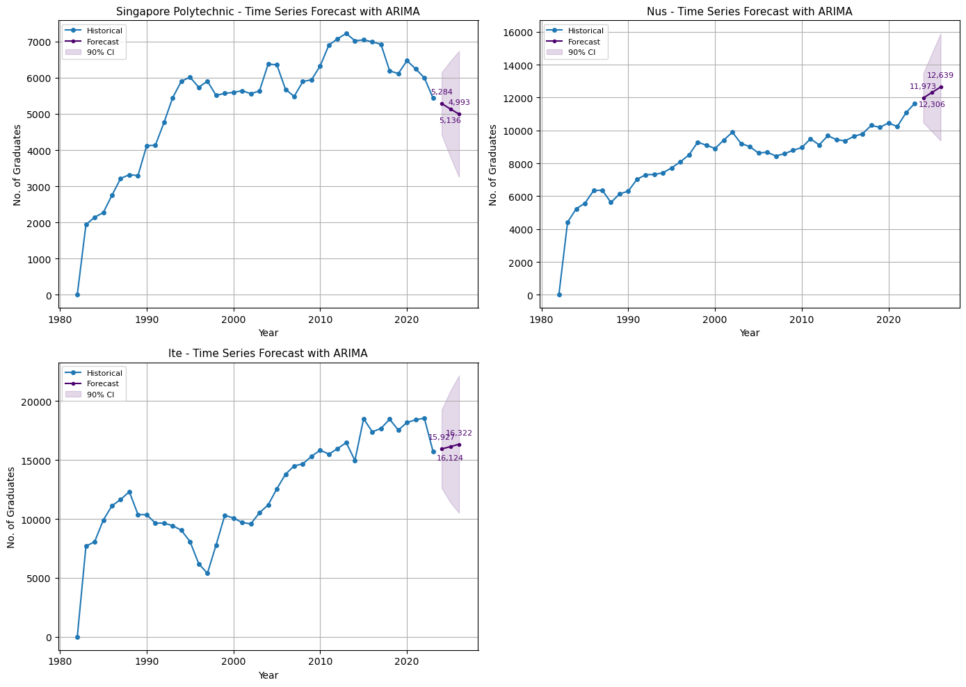
Time Series Forecasting with ARIMA Model
Visualizing forecasts 3 time steps ahead with ARIMA model. The blue line represents the historical data, while the purple line represents the forecasted values, for the next 3 time stamps into the future. The purple area is the 90% confidence interval of the forecast. (Actual values tend to appear 90% of the time in that area.)
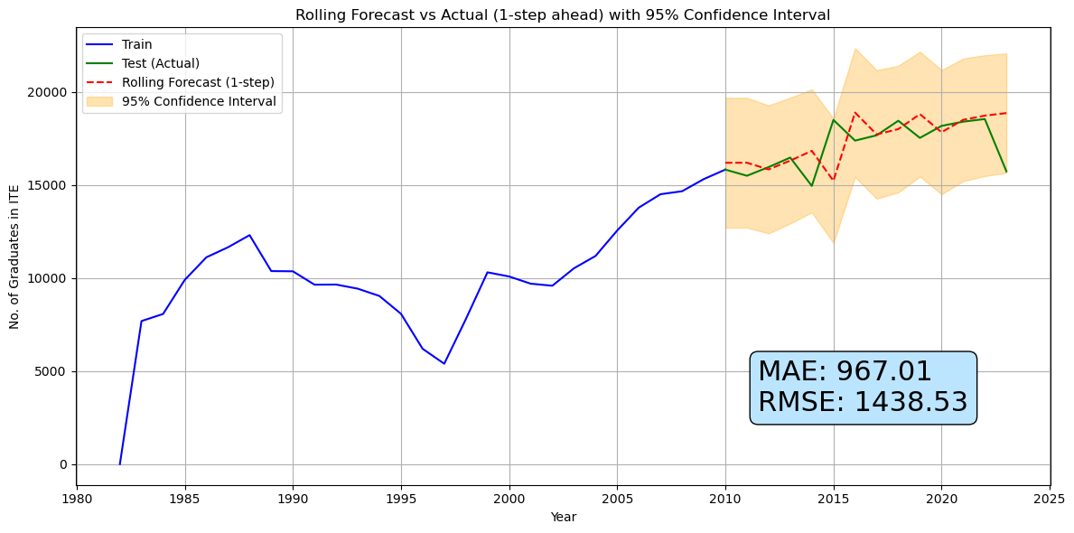
Time Series Model Evaluation on a single instituition
Testing the accuracy of ARIMA Model on my data set. I split the data into train and test sets, where the forecasts were plotted against the actual value. The orange area reveals the 95% confidence interval of the forecast. From the plot, we observe that actual values tend to appear 95% of the time in that area. Though simple, ARIMA is a powerful model for time series forecasting as it offers great accuracy with it's generality.
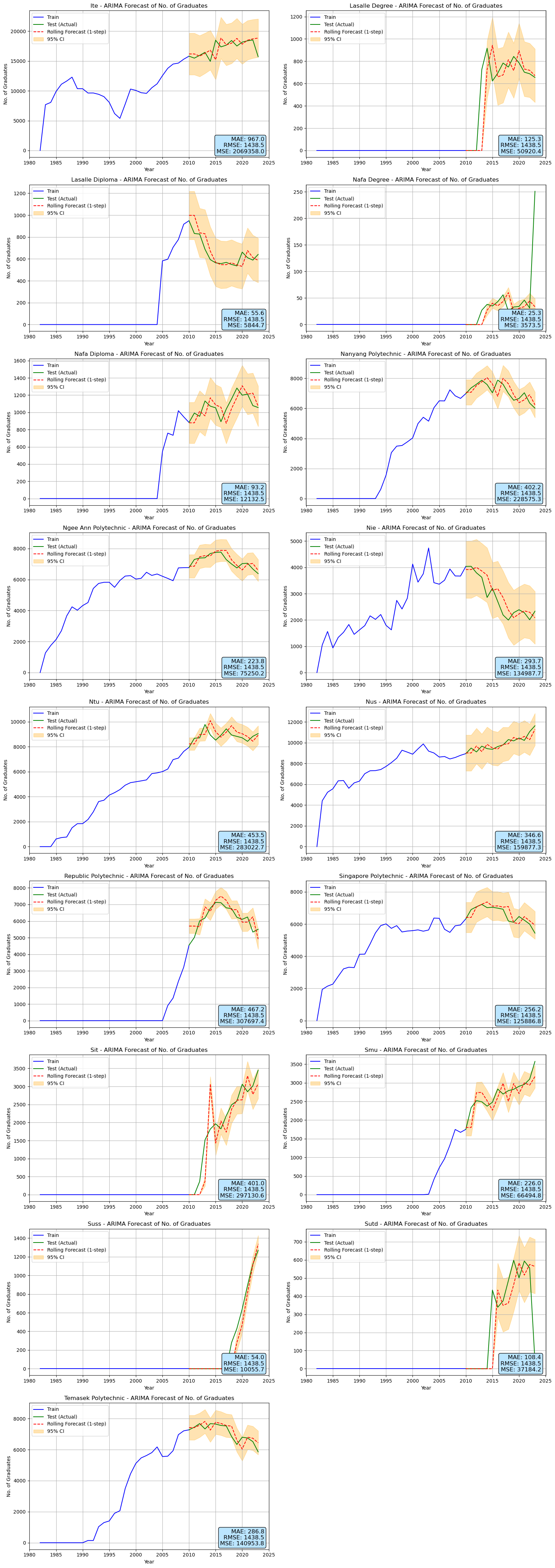
ARIMA Model Evaluation across all instituitions
Visualizing accuracy of ARIMA model across all instituitions. The metrics used to evaluate the model were Mean Absolute Error (MAE), Mean Squared Error (MSE) and Root Mean Squared Error (RMSE). The ARIMA model performed reasonably well across all instituitions, with relatively low error metrics, implying good model performance. This was really fun to code as it was interesting to see how the model performed across different instituitions.
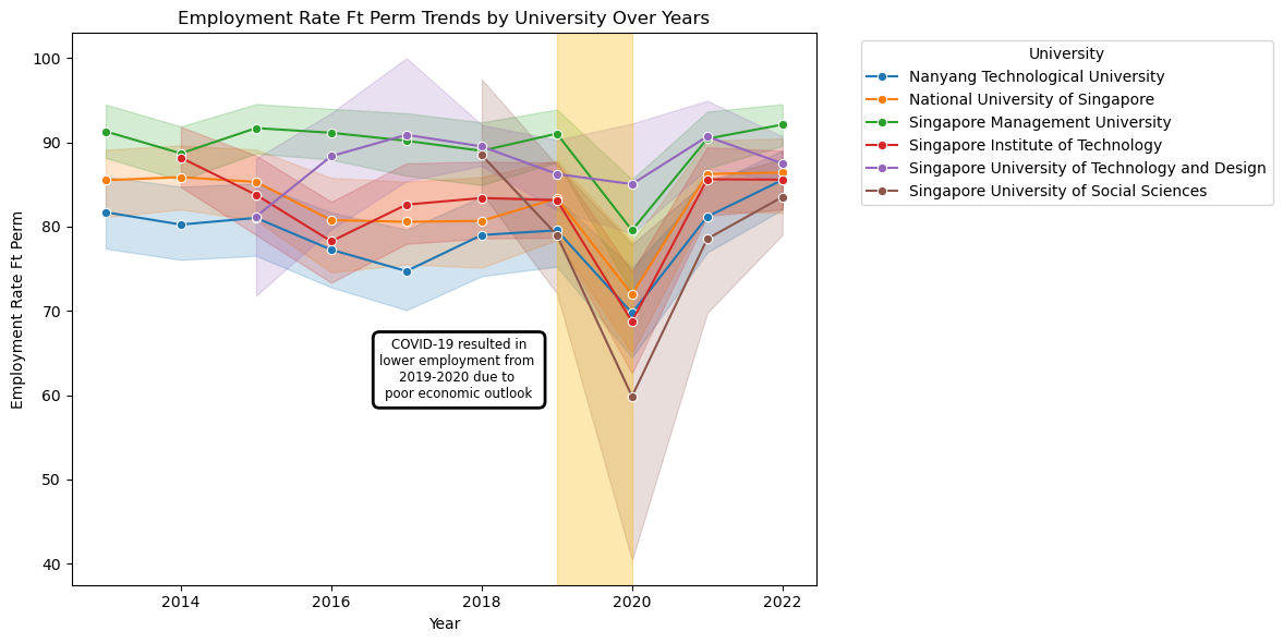
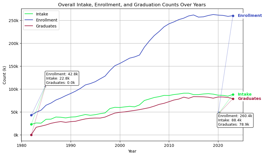
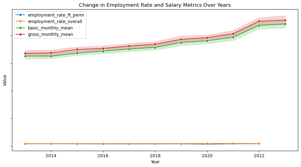
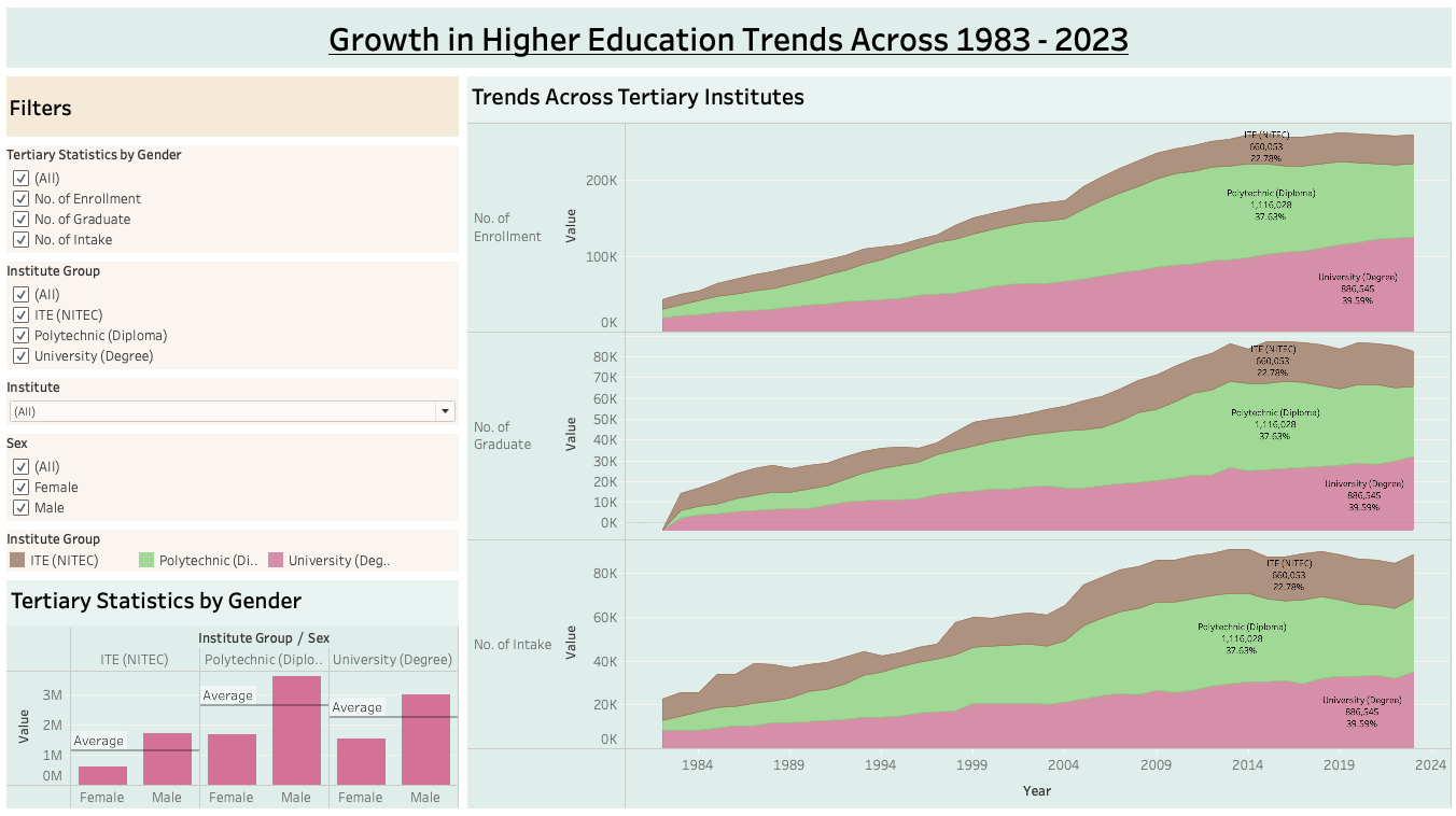
Employment Trends Across Universities in Singapore
Analysis of how employment rates have changed over time across different universities in Singapore and economic events that led to a steep fall in employment. This visualization was created using matplotlib and seaborn in Python.
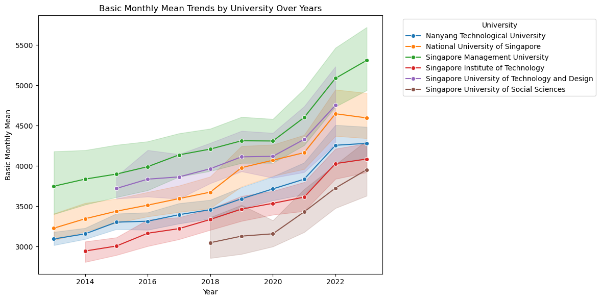
Growth of Mean Salary across Universities over Time
Using Matplotlib, Seaborn, and a colormap module in Python, we visualized trends in mean graduate salaries across different universities in Singapore over time. The plot illustrates how average salaries have evolved for each institution, highlighting disparities in salary growth between universities. A 90% confidence interval is included to reflect the statistical uncertainty around the mean estimates.
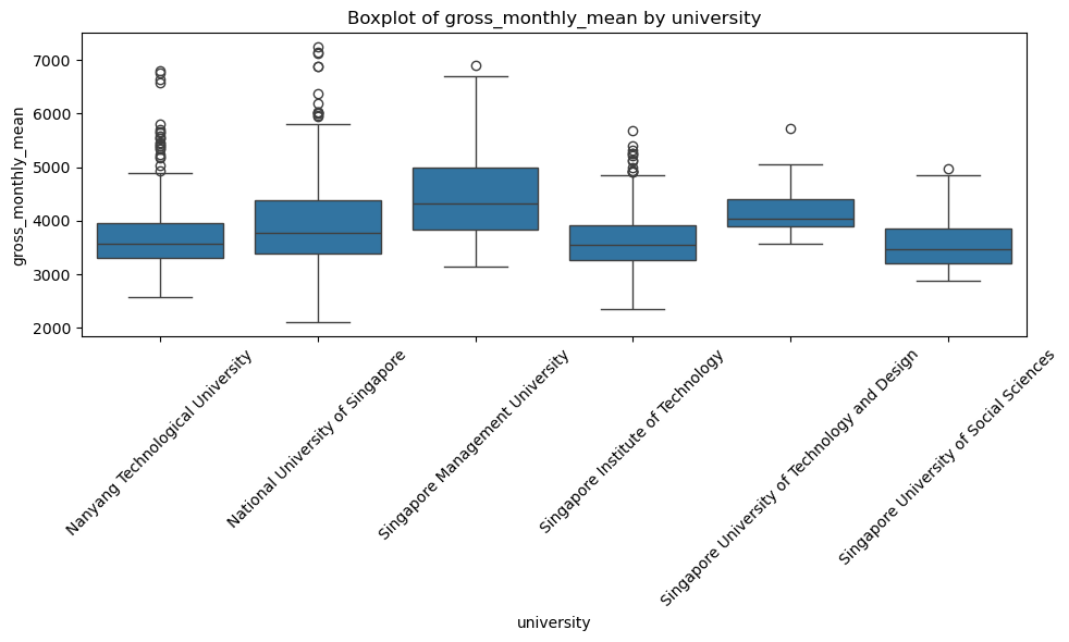
Distribution of Average Salary across Universities
This boxplot, created using Matplotlib and Seaborn in Python, visualizes the distribution of graduate salaries across Singaporean universities. It highlights differences in median salaries and the variability in salary outcomes between institutions.
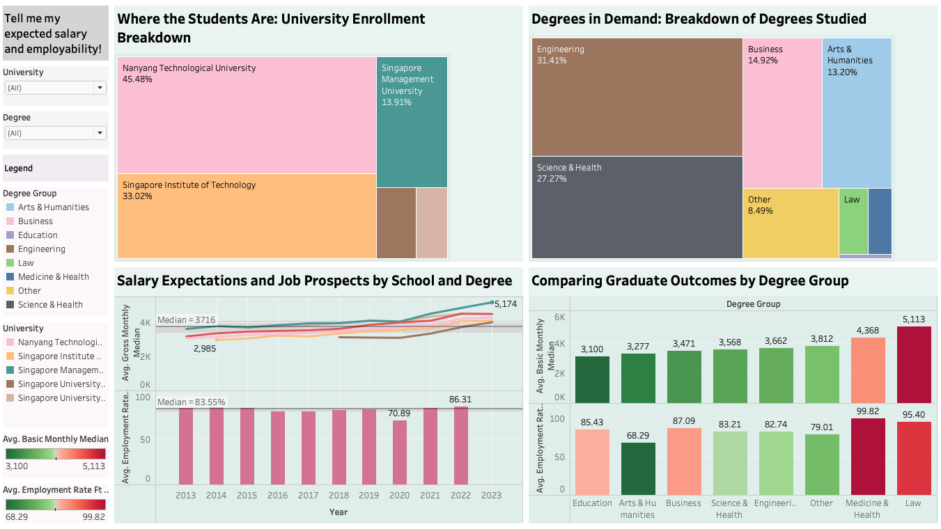
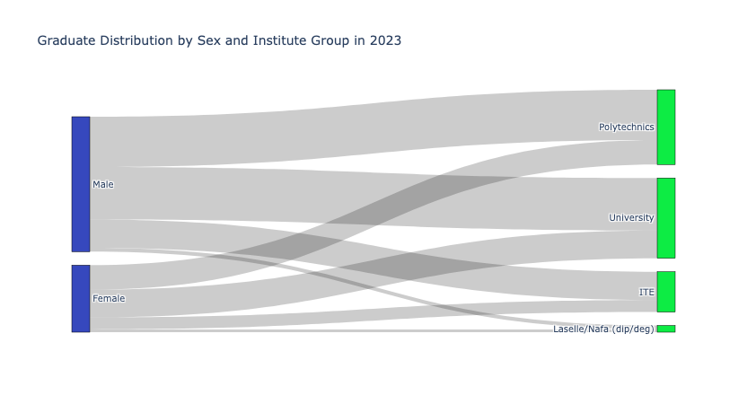
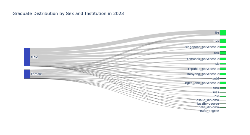
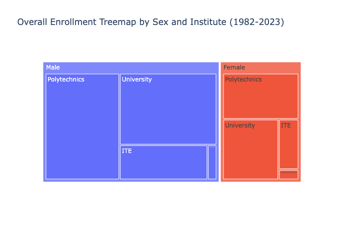
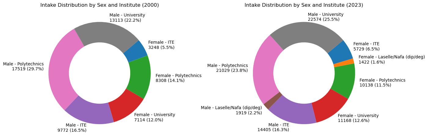
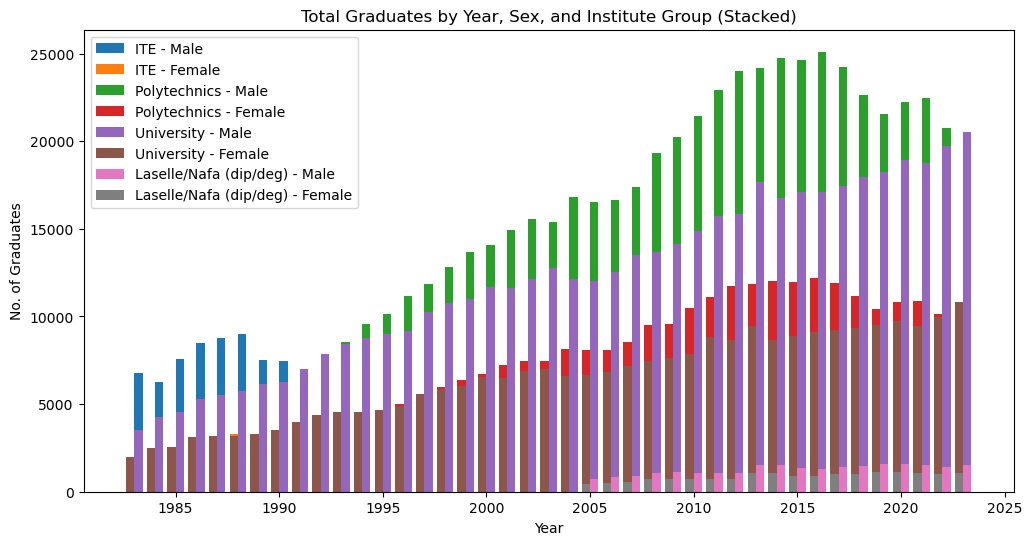
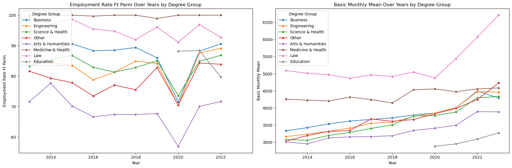
Education and Graduate Career Prospects in Singapore
We visualized of the distribution of student enrollment in various universities and distribution of academic areas chosen to study. We also analysed and compared graduate outcomes across degree groups by comparing median salaries and rate of full time employment.
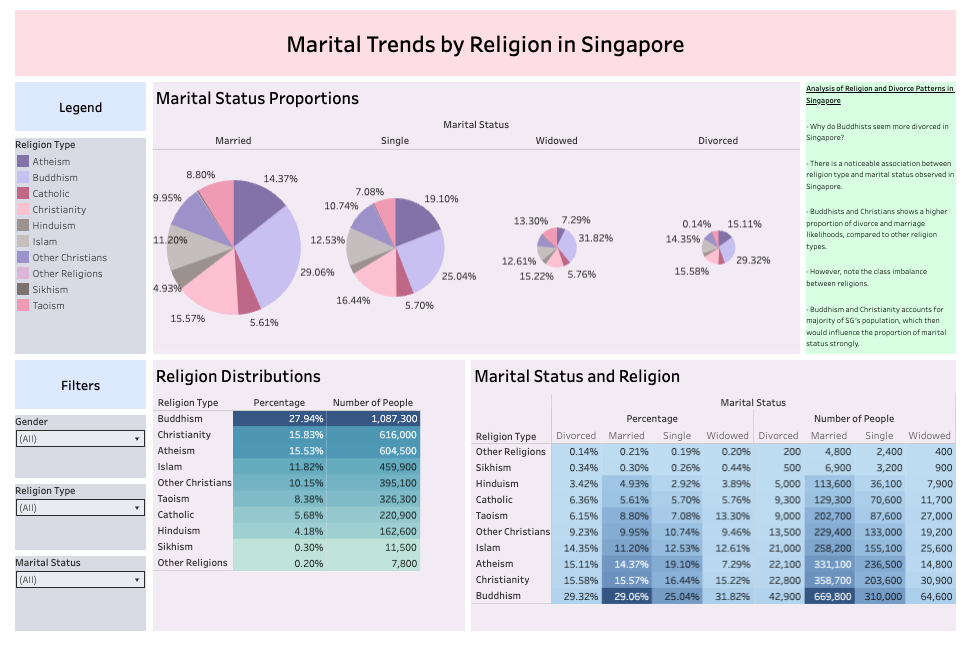
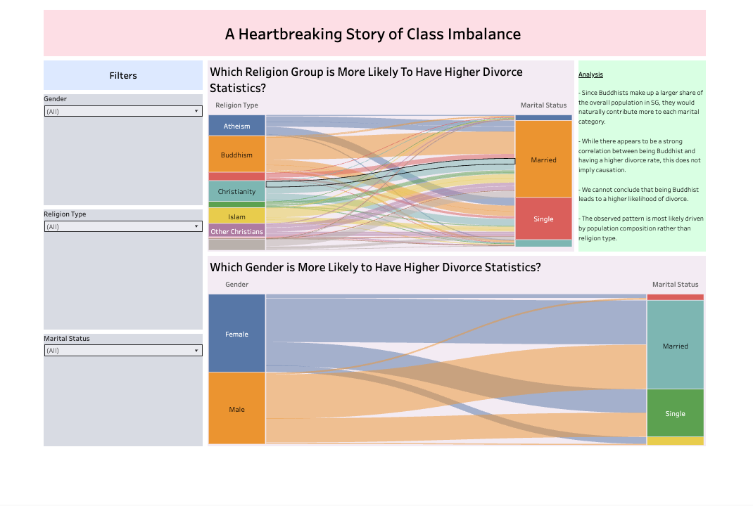
The Problem of Class Imbalance in Determining Statistical Significance
Though there is a noticeable relationship between being religion type and specific marital outcomes such as married and divorced, we note that both Buddhism and Christianity takes up a large proportion of the population demographics, which would influence the proportion of marital status strongly .
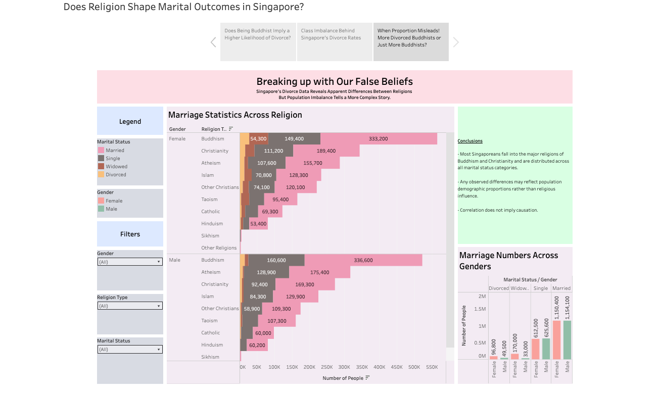
Correlation does not imply causation.
Any observed differences may reflect population demographic proportions rather than religious influence on marital status. Population class imbalance tells a more complex story, rather than a simple conclusion that being in a certain religion influences specific marital outcomes.
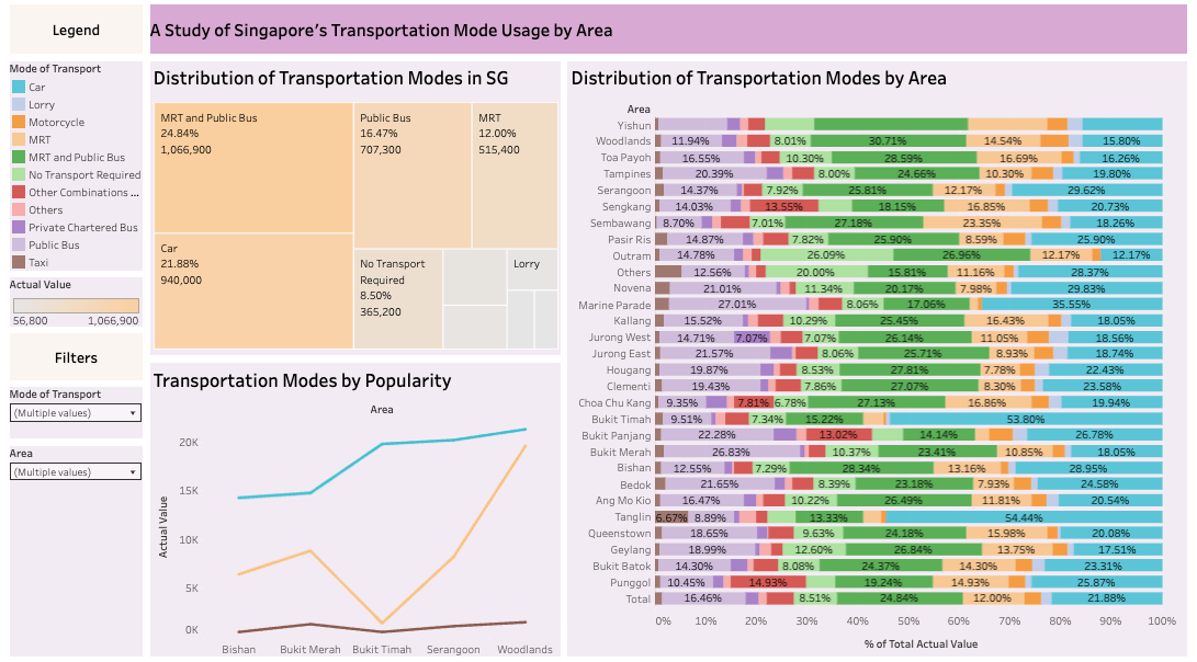
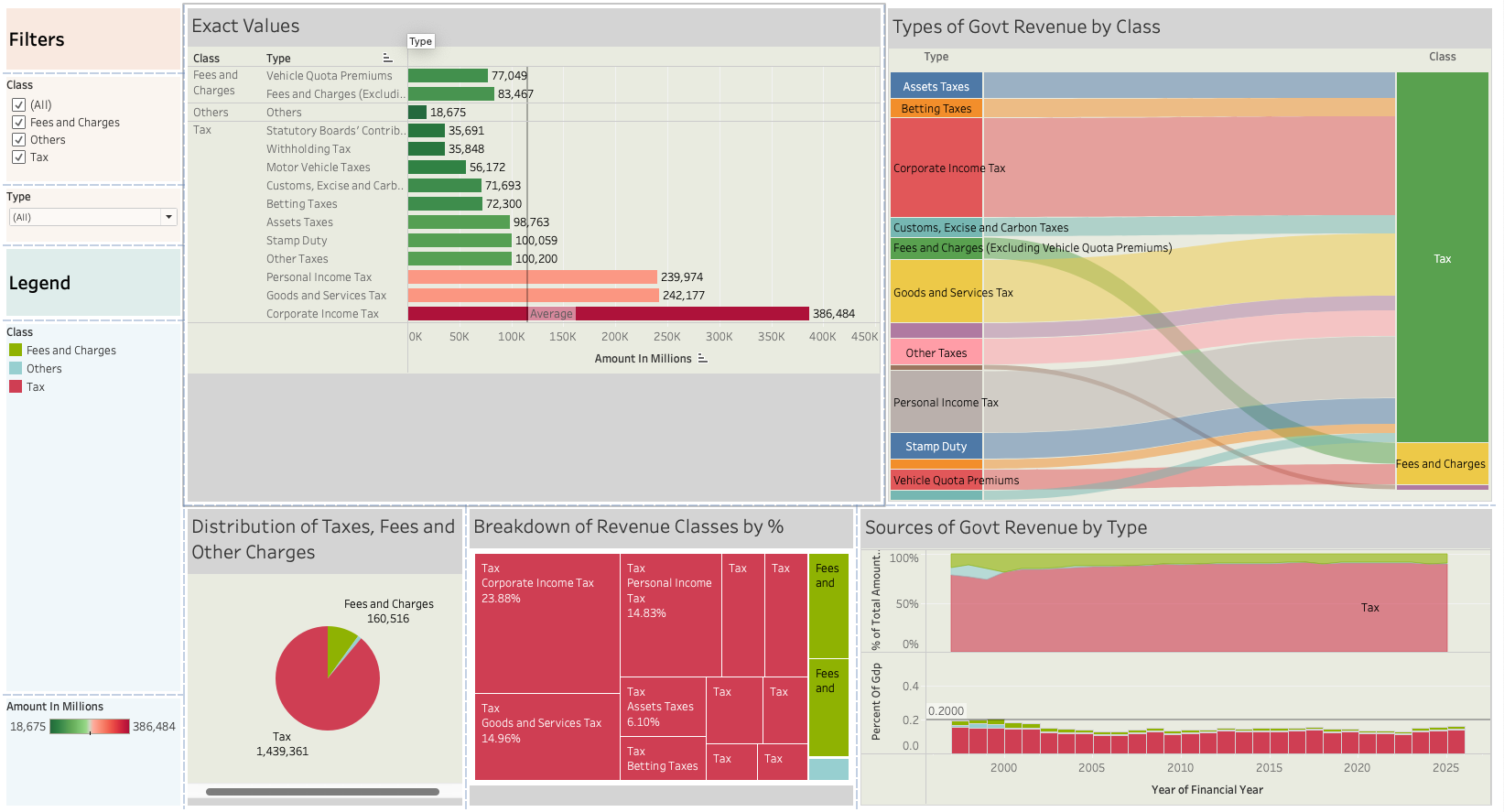
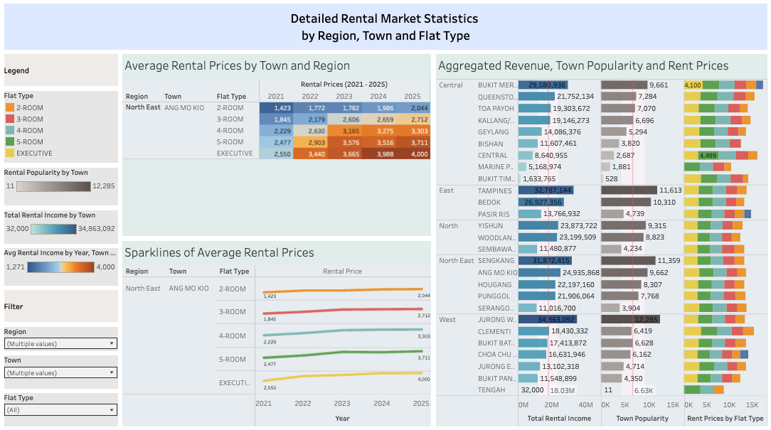
Transportation Trends Across Singaporean Workers
I imagined I was working for an agency that wanted to improve the commute experience for Singaporean workers, and wanted to know which mode of transport it should focus its' expenditures on, in order to benefit majority of it's citizens. Numbers in each categories were aggregated by utilizing calculated fields and fixed LODs.
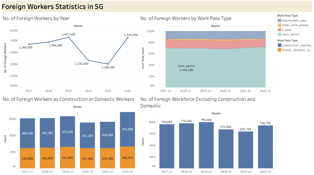
Exploring The Rise of Foreign Workers Statistics in Singapore
Visualizing how the in-flow of foreign workers have steadily increased, by breaking down into specific components that lead to the increase, such as the in-flow by type of worker (workforce/construction/domestic workers) and by type of work pass allocated (work permit/s-pass/employment pass).

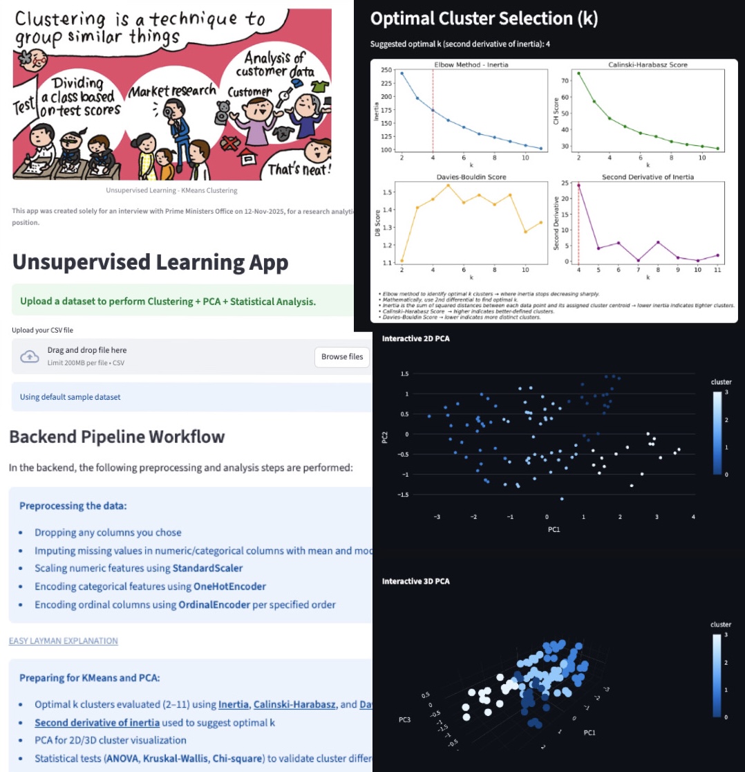
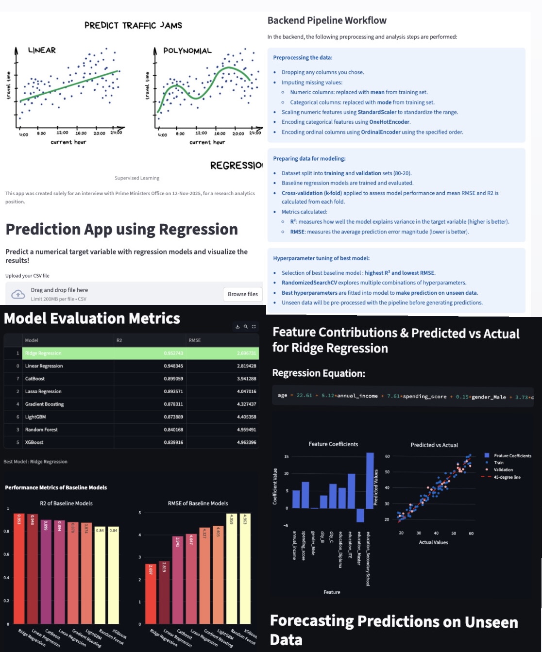
Predictions with Regression Models App
Created this App specifically for an interview with the Prime Ministers' Office Communication Group, for a research analytics role, on 12-Nov-2025.
I wanted to create something useful for forecasting predictions from data, that the interviewers could use in their daily work.
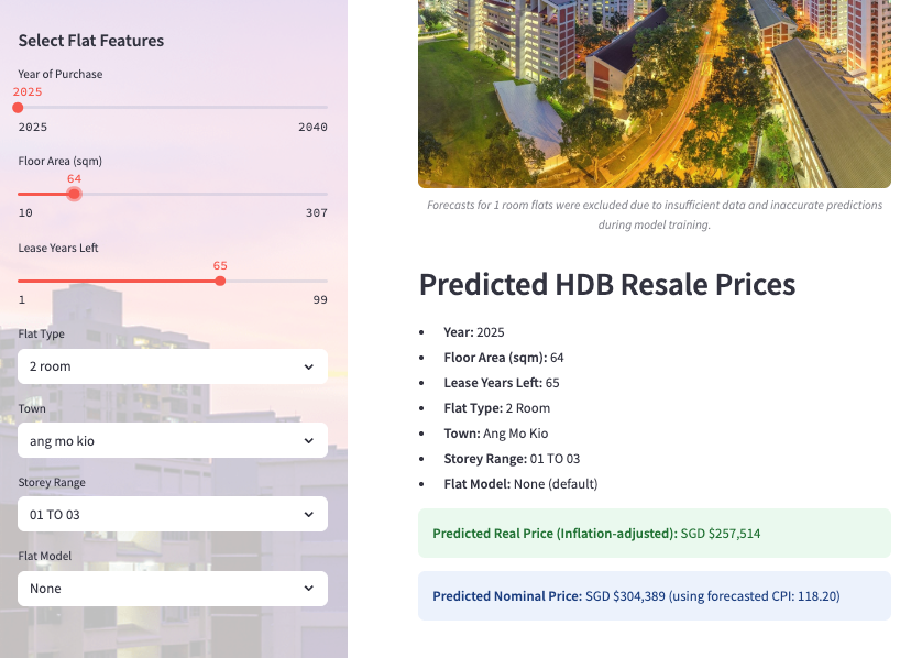
HDB Resale Price Predictor App
Deployed my machine learning model from a personal project, analysing past HDB resale prices
to forecast future HDB resale prices, based on a user's input of desired housing features. Predictions were adjusted for inflation.
The app was coded with with Python, then deployed on Streamlit Cloud.
Lastly, I leveraged CSS and HTML to design the web app beautifully. It was pretty fun to deploy my model into something interesting for others to use.
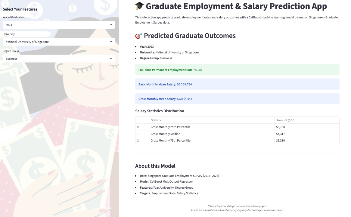
Fresh Grad Salary Predictor App
What will my estimated fresh grad salary and employment rate look like if I graduated from a XXX University, studying XXX course, graduated in XXX year?
Lastly, I leveraged CSS and HTML to design the web app beautifully. It was pretty fun to deploy my model into something interesting for others to use.

Dad Jokes App (API, Automation and Web Scraping)
This streamlit app was created to practice automating a connection with an API,
to generate dad jokes infinitely without repetition.
I created this to bring laughter to others, and practice how to deploy an app,
as I am working on deploying future automated data analysis and prediction apps.
Conveniently, I learnt to code my first personal portfolio page, on the app.
This page you are currently seeing is my third attempt at making a personal portfolio,
coded with CSS, HTML and JAVASCRIPT.
I'm pretty new at coding websites, but it has been interesting to learn, as it is something outside of data analytics!
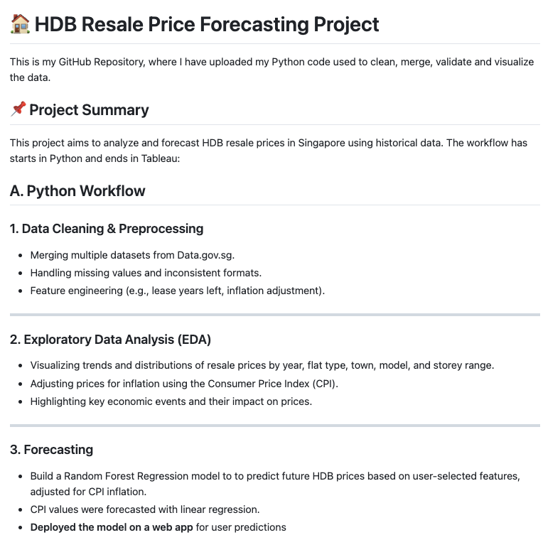
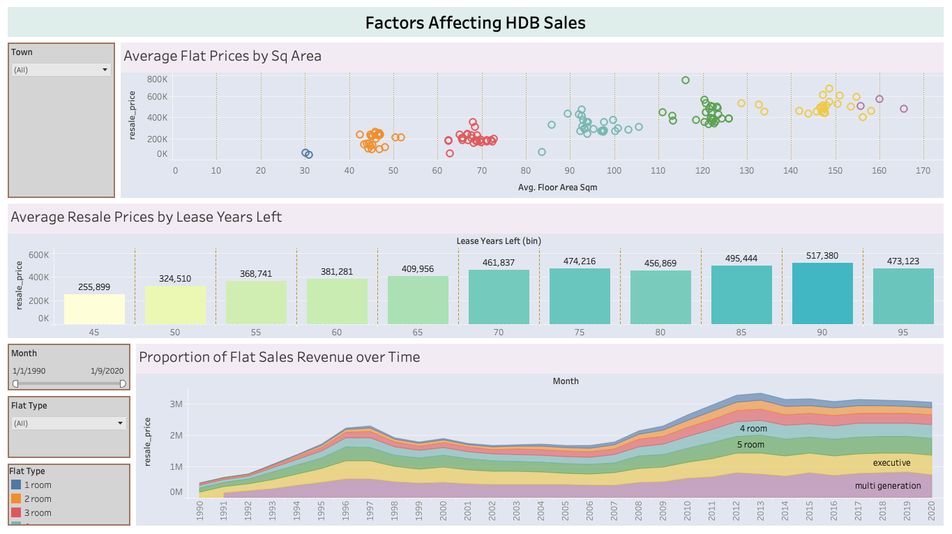
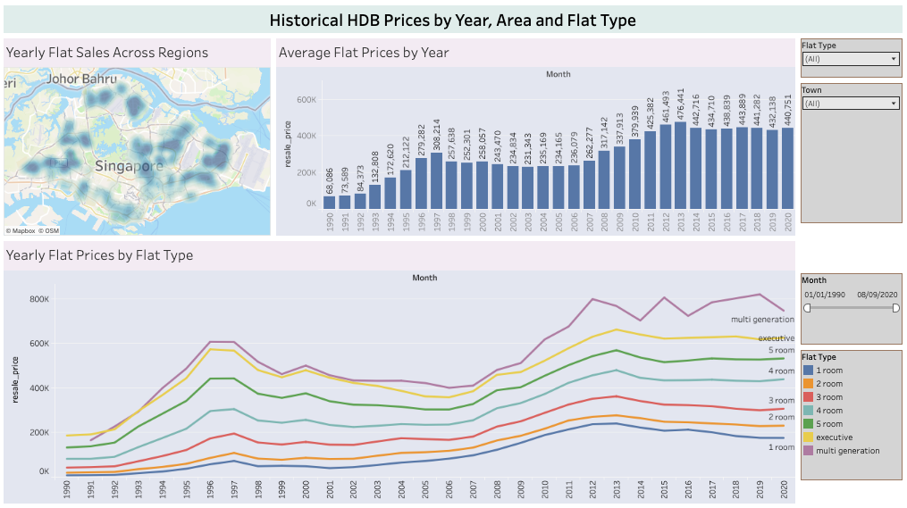
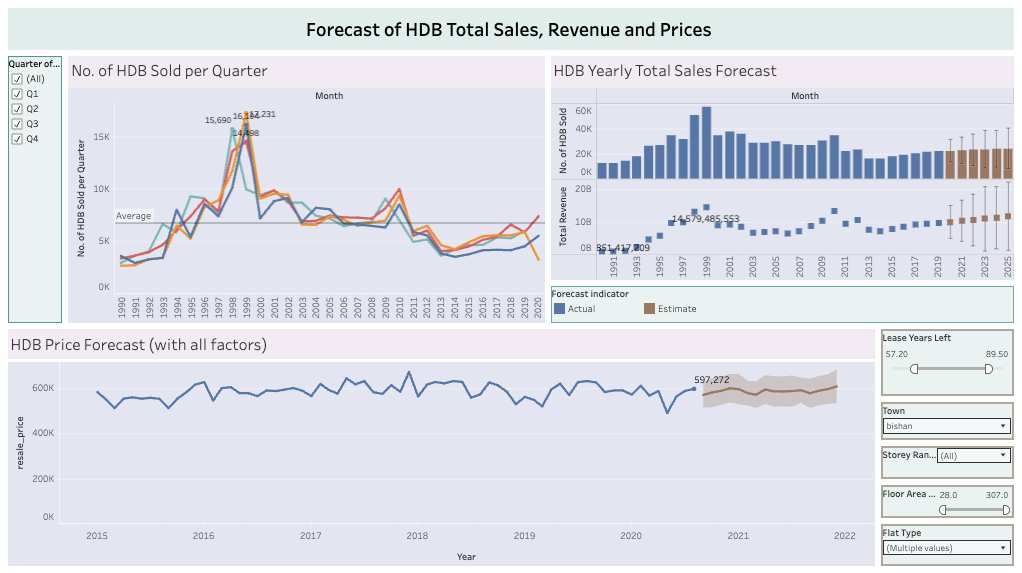
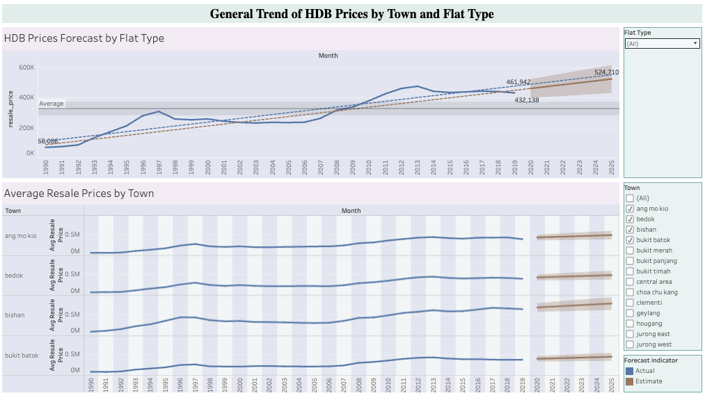
HDB Price Analysis and Forecasting Project
This project aims to analyze and forecast future HDB resale prices in Singapore.
Data pre-processing was first carried out, where I cleaned the data, handled missing values and inconsistent formats.
Then I merged multiple resale data sets. Then, with a separate CPI data set, I adjusted nominal prices for inflation to reflect its' real value.
Next, exploratory data analysis was conducted, where I visualized trends of resale prices by year, flat type, town, flat model and storey range.
I then researched the economic events that resulted in steep changes in HDB prices, annotating them on the overall trend visualization with Python.
Lastly, I created a machine learning model with Random Forest Regression to forecast future HDB resale prices.
Two models were created - a more generic model that allowed for greater accuracy and a second more specific model that allowed for more feature input.
The two models were then deployed on a web app to allow users to forecast HDB resale prices based on their desired HDB features.
The final predicted HDB resale prices were also adjusted for inflation by using forecasted CPI values, which were attained from a separate linear regression model.
This app can be found under "Apps Deployed" section.
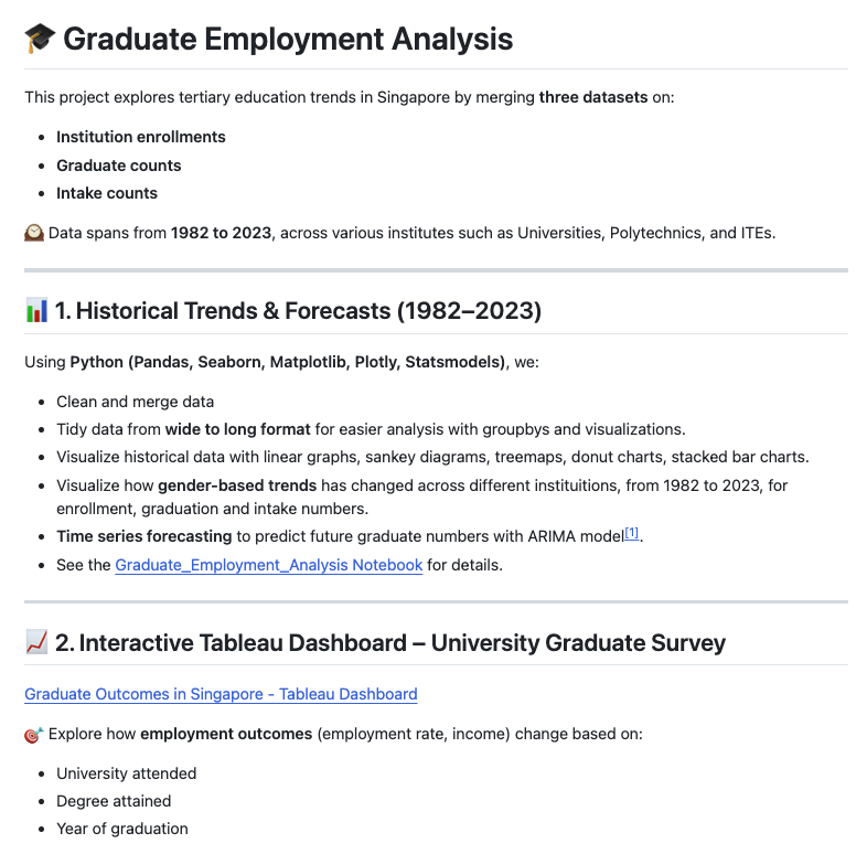
Graduate Employment Analysis
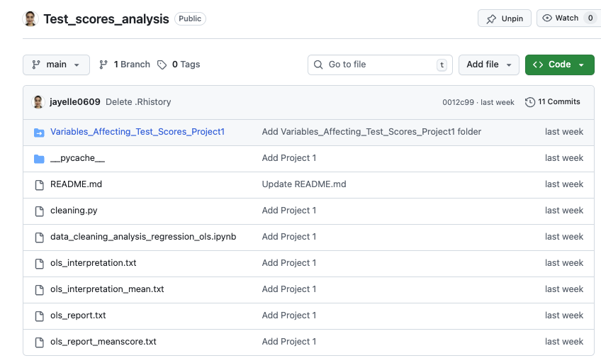
This is my GitHub Repository, where I have uploaded my Python code used to clean, merge, validate and visualize graduate outcomes in Singapore. The link to my Tableau Visualizations can be found in the repo too.
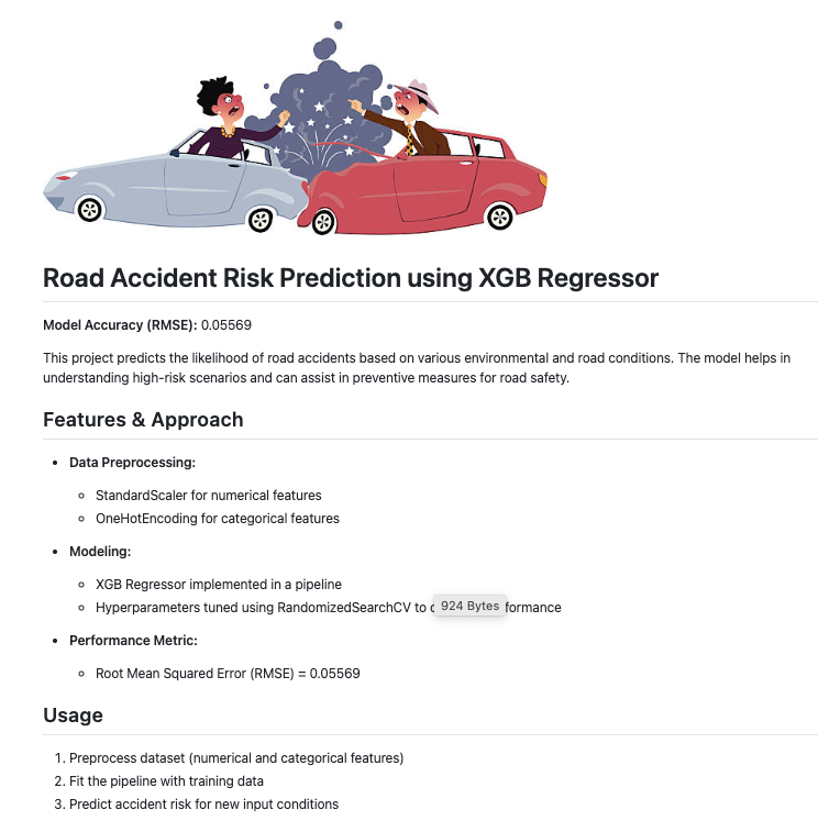
Predicting Road Accident Risk with XGB Regressor Model
Model Accuracy Score = 0.05569 (RMSE).
Predicting likelihood of road accidents based on different environmental and road conditions.
Preprocessed data with StandardScaler and OneHotEncoding, before fitting into pipeline.
Then, tuned hyperparameters with RandomSearchCV to get the best model parameters.
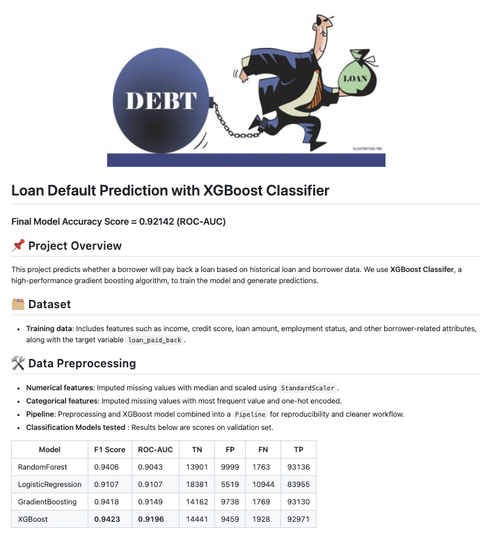
Predicting Loan Repayment with XGB Classifier Model
Model Accuracy Score = 0.92142 (ROC-AUC).
Predicting likelihood of loan default and repayment based on character demographics.
Preprocessed data with StandardScaler and OneHotEncoding, before fitting into pipeline.
Then, tuned hyperparameters with RandomSearchCV to get the best model parameters.
Education and qualifications
End of Portfolio